Arguably one of the definitive books about the British experience of World War I, Tommy: The British Soldier on the Western Front 1914-1918 by the late Robert Holmes has received a glorious new treatment from The Folio Society in time for the 100 year anniversary of the Battle of the Somme.
We spoke to some of the team behind the release to discover how best to honour such an important book at such an important time.
Although it’s not being framed as such, Tommy can’t help but feel like The Folio Society’s response to the Somme centenary. What made it the right book for 2016?
Mandy Kirkby (Editor): It is our response to the Centenary, that’s exactly right. And there weren’t really any other contenders. Tommy is about the life of the ordinary British soldier on the Western Front, and the British manpower involved in the Battle of the Somme was tremendous, men from all over Britain, from all walks of life, exactly the kind of men Richard Holmes features in his book. Also, Holmes does cover the Somme in some detail, through analysis and first-hand testimony.

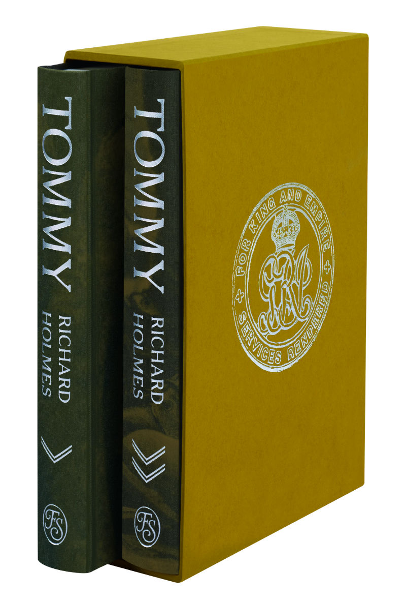
The use of Buckram with the uniform close-ups creates such a fantastically tactile and intimate effect: what was the creative process like that led you to that particular treatment?
Sheri Gee (Art Director): When we were discussing possible approaches to the binding, Mandy expressed the importance of making it about the everyday Tommy. We looked at photographs of them eating, relaxing etc but the photographs looked almost too frivolous, if we had chosen them for the binding. To zone in on a small element in some way takes away the personal but in other ways it gives the bindings a first-person treatment, being in such close proximity.
Were any other treatments considered?
SG: There were many other treatments considered. It was very hard to get away from the brilliant photo on the paperback. It seemed to say all that was needed, but we wanted to explore other avenues, we knew the answer was out there. We considered an illustrated approach, but rejected it as it could feel too much like fiction; also photography of objects that the Tommy would have used, like a mess tin etc, but that would not have been quite as personal as we would have liked.

The slipcase is an elegant counterpoint to the covers themselves, what was the process for that? What led you to the silver badge?
MK: We’d been looking at books about WW1 uniforms, so we could check certain details on the bindings, and we just came across the Silver War Badge in one of those books. It seemed completely appropriate – elegant (as you say) and poignant and respectful.
SG: The simplest thing would have been to add another photograph. We had considered several for the purpose, but it was too much. The bindings needed a quieter frame. Mandy showed me a photo of the badge wondering if we could do anything with it and with a little redraw we were able to consider blocking it in silver. I was particularly delighted with the paper colour. I’d started looking at khaki, trying to get close to the tunic fabric, but in paper that seemed to lean towards inadequate beiges, nothing got close to the exact cloth. The lime leant in the opposite direction and really seemed to lift the printed covers.
Akzidenz Grotesk is clever font choice given its history, was it tough finding something that had the cache but was also fit for purpose in terms of readability?
Charlotte Tate (text designer): Akzidenz Grotesk does have a really interesting history. Although it’s widely used in contemporary design, it is in fact one of the earliest sans serif typefaces, dating back to 1896. We’ve used it for the headings and for the section titles, which sit against a backdrop of very strong, sometimes harrowing photographs. We also needed a typeface that would sit well with that used for the main text, Fournier.
It’s visually inspired from the typography found in The Wipers Times, the Tommies’ newspaper, and so has the right period feel. Its strong letterforms hold well alongside those photographs, whilst keeping the design simple and respectful to the subject matter, without over embellishing.

How do the interior pages themselves differ from the original publication?
MK: We’ve re-set the book in a new typeface, and the pages are beautifully designed, with generous margins, and printed on high-quality paper.
The original publication included 32 pages of b & w photographs; we’ve doubled the amount, so we have 64 pages of photos (split between the two volumes), plus frontispieces and some glorious single photographs spread over double pages, so you can revel in the details.
We’ve used several of the images from the original publication as they are so particular to the text and were, of course, specially chosen by Richard Holmes, but we’ve added many of our own. We’ve been able to reproduce the images to a larger size than the original book and our reproduction is especially crisp and fine. The book is an absolute pleasure to read; we’re very proud of it.
What book in The Folio Society catalogue would you recommend as a companion read to Tommy and why?
MK: The Middle Parts of Fortune by Frederic Manning, described by William Boyd as ‘the finest novel to come out of the First World War’. It describes the Battle of the Somme from the viewpoint of an ordinary soldier, by a writer who served on the Somme. His soldiers are resentful and angry at their situation, fill the gaps between fighting in pursuit of sex, drink and food, are without patriotic zeal and yet show great loyalty to one another.
Holmes’s Tommies have stepped straight out of his book and into this one. It feels utterly genuine.
Tommy: The British Soldier on the Western Front, 1914-1918 by Richard Holmes is available now from the Folio Society. For more on World War I, pick up the new issue of History of War or subscribe now and save 25% off the cover price.